ShopDreamUp AI ArtDreamUp

Deviation Actions

Private collection, please do not unlock
private drawings such as sketches, portraits and various handmade drawings. Due to the fact that it is not possible to hide folders, I decided to use this form of collecting my works
$100/month


Suggested Deviants


Suggested Collections


![Budgie Portrait da no. 3 [3DS]](https://images-wixmp-ed30a86b8c4ca887773594c2.wixmp.com/f/63dfab32-1e03-4eb0-a643-0234063b8c39/d95nrqw-c353a312-2ef5-4875-9d0a-10365481af99.jpg/v1/crop/w_184,h_184,x_15,y_0,scl_0.38333333333333,q_70,strp/budgie_portrait_da_no__3__3ds__by_twarda8_d95nrqw-92s-2x.jpg?token=eyJ0eXAiOiJKV1QiLCJhbGciOiJIUzI1NiJ9.eyJzdWIiOiJ1cm46YXBwOjdlMGQxODg5ODIyNjQzNzNhNWYwZDQxNWVhMGQyNmUwIiwiaXNzIjoidXJuOmFwcDo3ZTBkMTg4OTgyMjY0MzczYTVmMGQ0MTVlYTBkMjZlMCIsIm9iaiI6W1t7ImhlaWdodCI6Ijw9NDgwIiwicGF0aCI6IlwvZlwvNjNkZmFiMzItMWUwMy00ZWIwLWE2NDMtMDIzNDA2M2I4YzM5XC9kOTVucnF3LWMzNTNhMzEyLTJlZjUtNDg3NS05ZDBhLTEwMzY1NDgxYWY5OS5qcGciLCJ3aWR0aCI6Ijw9NjQwIn1dXSwiYXVkIjpbInVybjpzZXJ2aWNlOmltYWdlLm9wZXJhdGlvbnMiXX0.Nb6b8EvEpBxNXcNp-UFdo3lqkPTb3zy1Cah7KGEjfGA)
![Budgie Portrait da no. 3 [3DS]](https://images-wixmp-ed30a86b8c4ca887773594c2.wixmp.com/f/63dfab32-1e03-4eb0-a643-0234063b8c39/d95nrqw-c353a312-2ef5-4875-9d0a-10365481af99.jpg/v1/crop/w_92,h_92,x_8,y_0,scl_0.19166666666667,q_70,strp/budgie_portrait_da_no__3__3ds__by_twarda8_d95nrqw-92s.jpg?token=eyJ0eXAiOiJKV1QiLCJhbGciOiJIUzI1NiJ9.eyJzdWIiOiJ1cm46YXBwOjdlMGQxODg5ODIyNjQzNzNhNWYwZDQxNWVhMGQyNmUwIiwiaXNzIjoidXJuOmFwcDo3ZTBkMTg4OTgyMjY0MzczYTVmMGQ0MTVlYTBkMjZlMCIsIm9iaiI6W1t7ImhlaWdodCI6Ijw9NDgwIiwicGF0aCI6IlwvZlwvNjNkZmFiMzItMWUwMy00ZWIwLWE2NDMtMDIzNDA2M2I4YzM5XC9kOTVucnF3LWMzNTNhMzEyLTJlZjUtNDg3NS05ZDBhLTEwMzY1NDgxYWY5OS5qcGciLCJ3aWR0aCI6Ijw9NjQwIn1dXSwiYXVkIjpbInVybjpzZXJ2aWNlOmltYWdlLm9wZXJhdGlvbnMiXX0.Nb6b8EvEpBxNXcNp-UFdo3lqkPTb3zy1Cah7KGEjfGA)


You Might Like…


Description
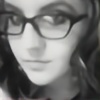
Attempt at mark making and value study.
For full details on how this piece came about please read description of
It's 2-3 hours of playing in Photoshop CS5 with Wacom Bamboo Pen and Touch using brushes are mainly CS5 Brush Sets but use of downloaded brushes by `DanLuVisiArt and given brushes by *T00xicpanda. While listening to Neurotic Fish (EBM).
Image size
2554x1447px 1.85 MB
© 2013 - 2024 missimoinsane
Comments23
Join the community to add your comment. Already a deviant? Log In
The shape of the bird is spot on (perfect), also I believe you captured the sparrow's fluffiness perfectly too. You didn't over or under do anything here, which can often times be the case with digital paintings, it can be hard to get that balance right. Your shade selection is also spot on, and I'm sure looks exactuly how its supoosed to on this particular variant of bird. However, if you where going off photographic reference or not (doesn't matter), I think you could have made him pop a little more in reaching the realistic and pushing a tad beyond it. For example on the upper beak area, I think some very small but strong light/white dots would really bring your attention to the birds face first. You could also streak some stronger highlighted areas on the top of the head for this effect as well, as a single dot on the eye like I've seen on your other bird painting. Another very minor change that would make a difference would be around his bum, I see a few strokes going away from his overall feather direction. I think you used that technic to build up some value you (which works), but you could also do that with very short slightly darker stroke following his feather direction, I think that would give him a more natural look there. And the foot on the other side of the bird is a little lighter than the one closer to us, since they are both in shadow, I think that would should be a hair darker (or about the same shade) not lighter. Honestly outside of those few again -minor- points, I think this is perfect. The bit of highline above and at the bottom of the feet are perfect not too much as to pull your eye there first, but not too little that you overlook the feet. Also your strokes on the chest and upper wing area especially are really lovely and make me want to pet him, since he looks so soft. Also the claws are perfectly shaped. Lastly I'm glad you gave the fill box back drop a texture so it doesn't clash the subject, I see that too much with digital paintings (I've even been guilty of it myself), and its refreshing to see someone to remember to carry the textures beyond the subject. Great work!